This project is password-protected

This case study contains client work shared in confidence. Enter the password from my application or message to view it.

Don't have the password? Reach out and I'll share it.

Design System REBUID REPAIR AND GOVERNANCE

Steering NIQ Through a Double Rebrand

When a mandated "Flash Green" rebrand triggered immediate WCAG failures and massive technical debt across 100+ enterprise products, I was brought in to architect a systemic solution. By overhauling our foundational tokens and building a resilient component architecture, I engineered a system built for change. When the business suddenly pivoted back to a blue identity mid-implementation, my architecture absorbed the shockwave with only 15% net-new effort. Ultimately, I transformed a crisis of technical debt into a fully documented, accessible, and governable enterprise design system.

23K Global B2B clients

At a Glance

Joining in the final 30 days of a 30-60-90 rollout, I served as planner, governor, and executor simultaneously — auditing the full system, building the Figma component library from scratch, and owning 5 of 11 platform modules directly while the team migrated off Sketch, Adobe XD, and Axure.

Sixty days later, the business pivoted back to blue. The same system absorbed it at 15% net-new effort. Every component reused, none rebuilt. A reversal it was never originally designed to survive.

Duration

  • 1st Rebranding: final 30 days of a 30-60-90 rollout

  • 2nd Rebranding: 60 days


Role

  • Design System owner

  • Planner · Governor · Executor

  • Figma onboarding specialist

Team

  • Product Managers

  • BI Developers

  • FE Developers

  • 3 Product Designers

Team

  • Product Managers

  • BI Developers

  • FE Developers

  • 3 Product Designers

Scope

  • Strategy & Governance

  • Design System recreation in Figma

  • Designer & developers onboarding

  • Owned 5 of 11 navigation modules

Scale & Impact

  • Interconnected ecosystem 100 apps

  • Costco, Walmart + 23K B2B clients

  • 60B data points, 95 countries

  • Directly affected: Rite Aid, Jumbo, CVS
Industry

  • Retailers

  • Manufacturers

  • Massive complex data

  • Advanced Analytics

Industry

  • Retailers

  • Manufacturers

  • Massive complex data

  • Advanced Analytics

NIQ Retail Platform Scale

NIQ Retail is not a single application—it is a comprehensive, enterprise-grade analytics ecosystem.

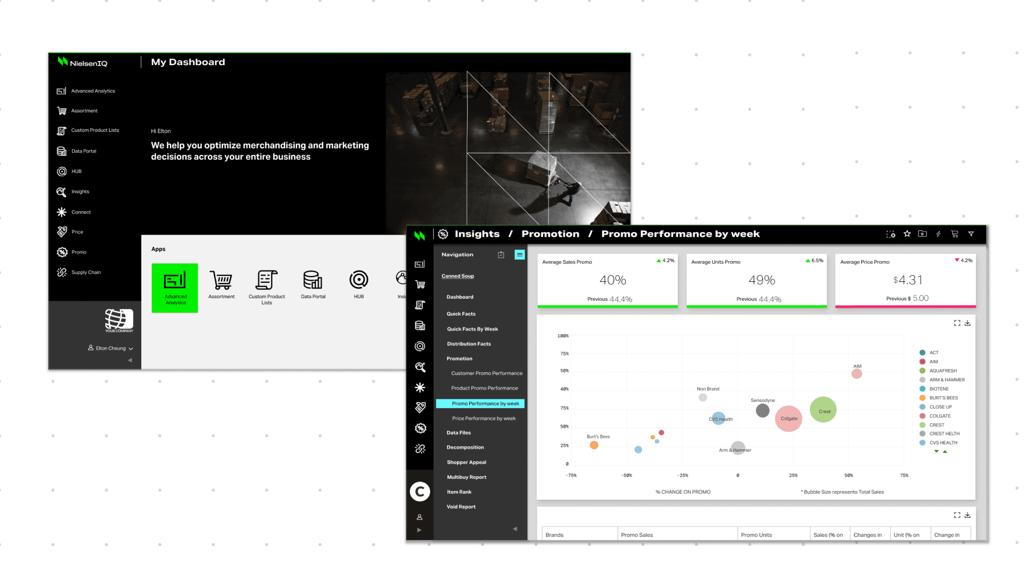
The platform unifies 11+ standalone applications (including Supply Chain, Price, Promo, Data Portal, Assortment), each housing its own complex architecture of reports, toolsets, and analytical workflows. Within this sprawling environment, I act as the principal design owner for six core applications: Advanced Analytics, Data Portal, Custom Product List, HUB, Insights, and Vantage.

What you see in the side nav is the entire retailer-side analytics surface: from performance reporting to promotional planning to supply chain. Insights module alone included 11+ reports and sub-reports. Governing the Design System for NIQ Retail meant every module, every workflow, and every enterprise client — including Walmart, Rite Aid, CVS, and Jumbo — simultaneously.
TL;DR

Context

NIQ rebranded Precima to flash green and black, then reversed direction mid-implementation — while the brand color doubled as the platform's "positive trend" data state.

Insights

At 100+ products across 95 countries, this wasn’t a color swap — it was a six-year tech debt audit disguised as a rebrand, spanning three tech stacks with active enterprise users who couldn’t be disrupted.

Solution

Audited the full system to map constraints and structural fixes, built governance and delivery phases the team could follow, executed the rebrand twice on live platforms — all while demoing the new direction to prospective clients in parallel.

Impact

The system outlasted two brand reversals, kept active users like Rite Aid, Jumbo, CVS running throughout, and won a new contract with Walmart Canada — proof the rebuilt foundation was sellable, not just survivable. After the blue suite shipped, NIQ handed me the next one for rebranding: Activate — a sibling analytics platform, equal in weight to Retails. In total: 3 rebranding mandates with active clients

Design System Rebuild & Double Rebrand Process

Rebrand 1 reconstructed the design system from scratch. Rebrand 2 reused every component and swapped the color — the same work, a fraction of the effort.

Net-new work

~95%

~15%

effort compressed, not the schedule

Rebrand 1 · Flash green

NIQ Retail ( Precima)→ NIQ Flash Green

~30-day crunch

Owned 5 / 11 modules

95% net-new

Audit & spec

Measured real specs

logged design + tech debt

Roadmap & governance

Phased roadmap + governance

planner · governor · executor

Design system (Figma)

Rebuilt the system from scratch

migrated team off Sketch · XD · Axure

Font base

Migrated to global font base

measured → synced

Accessibility / WCAG

Fixed accessibility across the suite

charts & tables especially

Team enablement

Onboarded designers + developers

Confluence playbook for Figma

Outcome

System shipped + debt logged

library live · team on Figma · backlog mapped

Rebrand 2 · NIQ blue

Flash green → NIQ blue

60 days

Same system, new color

15% net-new

Audit & spec

Spot re-audit only

system already mapped

Roadmap & governance

↳ roadmap reused from R1

Design system (Figma)

Every component reused

re-skinned, not rebuilt

Font base

↳ font base already synced

Accessibility / WCAG

Root cause fixed → blue

dark bg + pos/neg broke charts & tables

Team enablement

↳ team already on Figma

Outcome

Blue suite shipped — clean swap

correct color system, WCAG-safe

Built from scratch (R1)

New work in R2

Carried from R1

Outcome

R1 built the system. R2 proved it — every component carried; only the color changed.

R1 built the system. R2 proved it — every component carried; only the color changed.

NIQ Retail → NIQ Flash Green

Roadmap

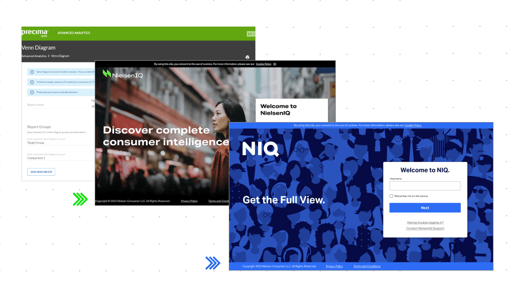
Following the acquisition of Precima, NielsenIQ (NIQ) launched a major rebranding effort to integrate its expanding data ecosystem ahead of its corporate spin-off. The company adopted a vibrant Flash Green color palette to visually signal its transformation into an independent, tech-forward market leader.

This visual overhaul required a complete, from-scratch rebuild of the entire product design language and system. I stepped into this high-stakes initiative during its final 30 days, serving as the project lead to drive execution, fix technical debt, and successfully launch the final suite.

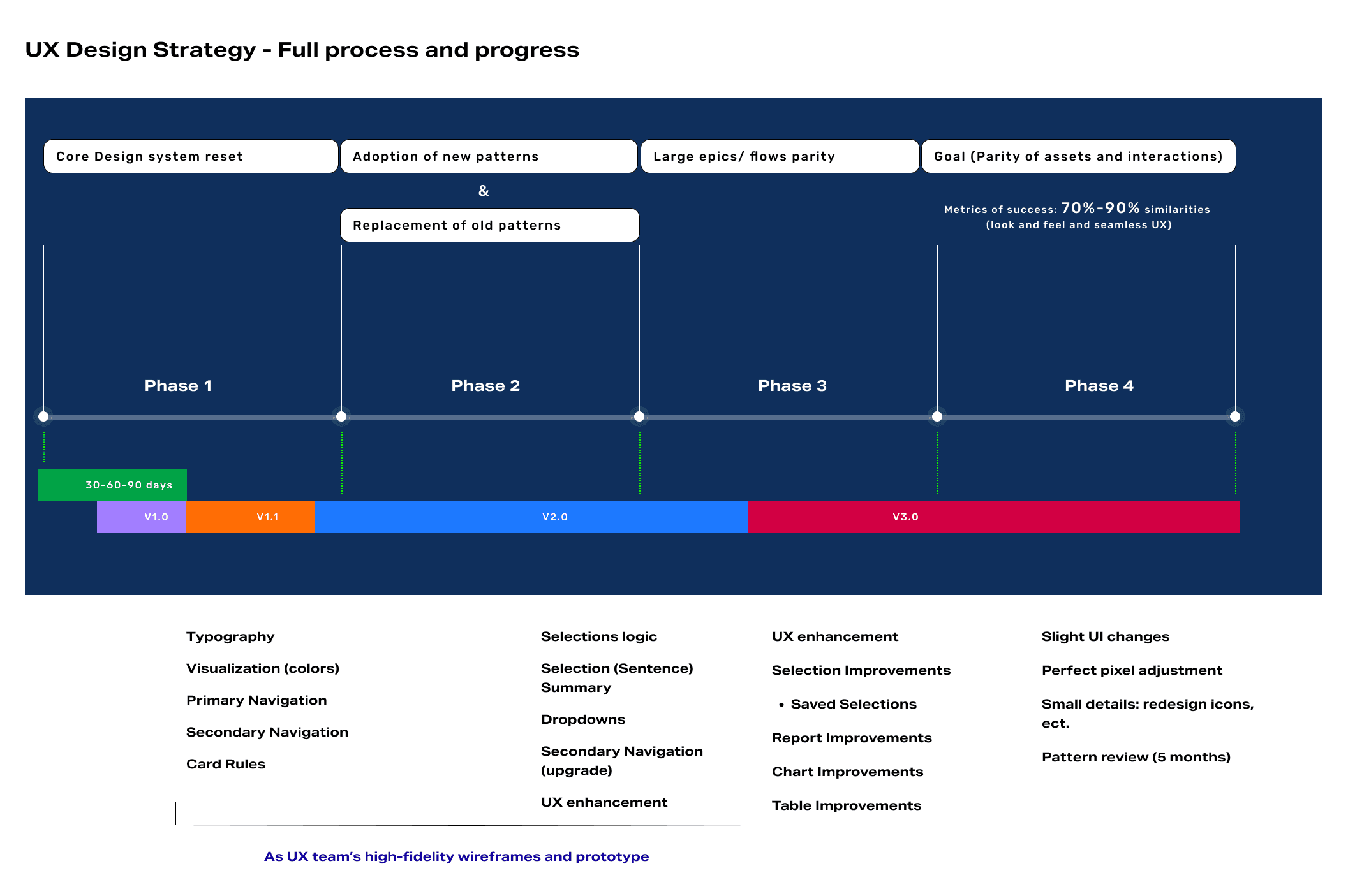
My audit drove the roadmap — four phases, sequenced by impact and team capacity, sized so components never repeated across sprints and the team could always see what was left.

Roadmap

Following the acquisition of Precima, NielsenIQ (NIQ) launched a major rebranding effort to integrate its expanding data ecosystem ahead of its corporate spin-off. The company adopted a vibrant Flash Green color palette to visually signal its transformation into an independent, tech-forward market leader.

This visual overhaul required a complete, from-scratch rebuild of the entire product design language and system. I stepped into this high-stakes initiative during its final 30 days, serving as the project lead to drive execution, fix technical debt, and successfully launch the final suite.

My audit drove the roadmap — four phases, sequenced by impact and team capacity, sized so components never repeated across sprints and the team could always see what was left.

Audit

Spearheaded a systemic component and page-level audit to map our migration from legacy to modern design systems: To drive cross-functional alignment, I authored Confluence documentation and a Figma workflow guide, enabling seamless developer collaboration within the design environment. I also instituted a real-time tracking framework for inconsistencies and priority calls, ensuring design debt was resolved incrementally rather than retrofitted.

Audit

Spearheaded a systemic component and page-level audit to map our migration from legacy to modern design systems: To drive cross-functional alignment, I authored Confluence documentation and a Figma workflow guide, enabling seamless developer collaboration within the design environment. I also instituted a real-time tracking framework for inconsistencies and priority calls, ensuring design debt was resolved incrementally rather than retrofitted.

Components in batch

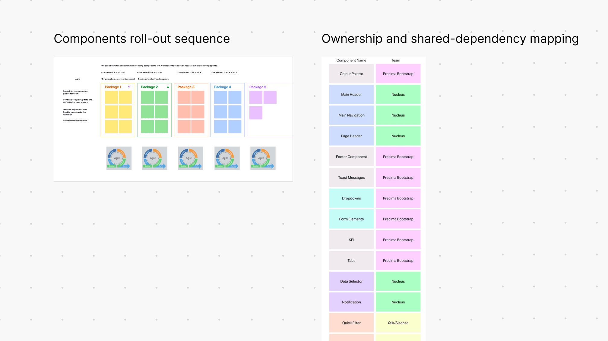
To sequence the rollout,, I mapped the entire component ecosystem by ownership—categorizing assets into direct control (Precima Bootstrap), shared (Nucleus), and third-party (Qlik/Sisense). By combining this dependency map with an impact-versus-effort matrix, I structured the migration into five distinct delivery packages—executing independent updates first while deliberately scheduling cross-functional dependencies to eliminate mid-sprint bottleneck.

Components in batch

To sequence the rollout,, I mapped the entire component ecosystem by ownership—categorizing assets into direct control (Precima Bootstrap), shared (Nucleus), and third-party (Qlik/Sisense). By combining this dependency map with an impact-versus-effort matrix, I structured the migration into five distinct delivery packages—executing independent updates first while deliberately scheduling cross-functional dependencies to eliminate mid-sprint bottleneck.

Structural Challenges

Technical and Design challenges:

  • Black backgrounds on the filter panel created cascading WCAG failures — compounded by the flash-green brand color, which duplicated one of the two states (positive/negative) already used across every chart and table.

  • Precima's coded components didn't match their Axure specs.

  • Font root sat at 12px against NIQ's 13px standard.

  • Spacing followed no scale — 15px, 17px, 20px, assigned ad hoc instead of tied to a 2px or 4px base unit.

  • Some applications were 6-7 years old, with styling too rigid to change even a single component's color.

Structural Challenges

Technical and Design challenges:

  • Black backgrounds on the filter panel created cascading WCAG failures — compounded by the flash-green brand color, which duplicated one of the two states (positive/negative) already used across every chart and table.

  • Precima's coded components didn't match their Axure specs.

  • Font root sat at 12px against NIQ's 13px standard.

  • Spacing followed no scale — 15px, 17px, 20px, assigned ad hoc instead of tied to a 2px or 4px base unit.

  • Some applications were 6-7 years old, with styling too rigid to change even a single component's color.

Solutions & Trade-off

When evaluating our migration strategy against NIQ's standards, I analyzed three potential paths: a resource-heavy 1:1 visual match, a moderate-cost code rewrite, or the direct adoption of NIQ's component specs—leveraging insights I gained firsthand collaborating with their Discover team. I championed a hybrid strategy rooted in the third option. By completely swapping out low-dependency, self-contained components while applying only minimum viable updates to complex, high-traffic systems, I balanced technical risk with rapid delivery. This pragmatic trade-off reclaimed 6–8 months of engineering effort that a 'pixel-perfect' polish would have consumed, reallocating that time directly into core system adoption.

Solutions & Trade-off

When evaluating our migration strategy against NIQ's standards, I analyzed three potential paths: a resource-heavy 1:1 visual match, a moderate-cost code rewrite, or the direct adoption of NIQ's component specs—leveraging insights I gained firsthand collaborating with their Discover team. I championed a hybrid strategy rooted in the third option. By completely swapping out low-dependency, self-contained components while applying only minimum viable updates to complex, high-traffic systems, I balanced technical risk with rapid delivery. This pragmatic trade-off reclaimed 6–8 months of engineering effort that a 'pixel-perfect' polish would have consumed, reallocating that time directly into core system adoption.

NIQ Retail Flash Green→ NIQ Blue

Mid-Flight Pivot back to Blue branding

The shift back to blue wasn't publicly announced — but the reasons behind it were clear to everyone working on it. User feedback flagged the black theme and its green/red color scheme directly; the same colors doing double duty as brand identity and positive/negative data states created confusion at the exact moment people needed clarity. Internally, our design system team hit the same wall from a different angle — layering complex information on a dark background was consistently harder to get right than on white or grey. Between user signal and our own build experience, the direction was clear: revert to blue, fix the structural color conflict at its root.

Mid-Flight Pivot back to Blue branding

The shift back to blue wasn't publicly announced — but the reasons behind it were clear to everyone working on it. User feedback flagged the black theme and its green/red color scheme directly; the same colors doing double duty as brand identity and positive/negative data states created confusion at the exact moment people needed clarity. Internally, our design system team hit the same wall from a different angle — layering complex information on a dark background was consistently harder to get right than on white or grey. Between user signal and our own build experience, the direction was clear: revert to blue, fix the structural color conflict at its root.

Component-level tokens and major shift in data visualization

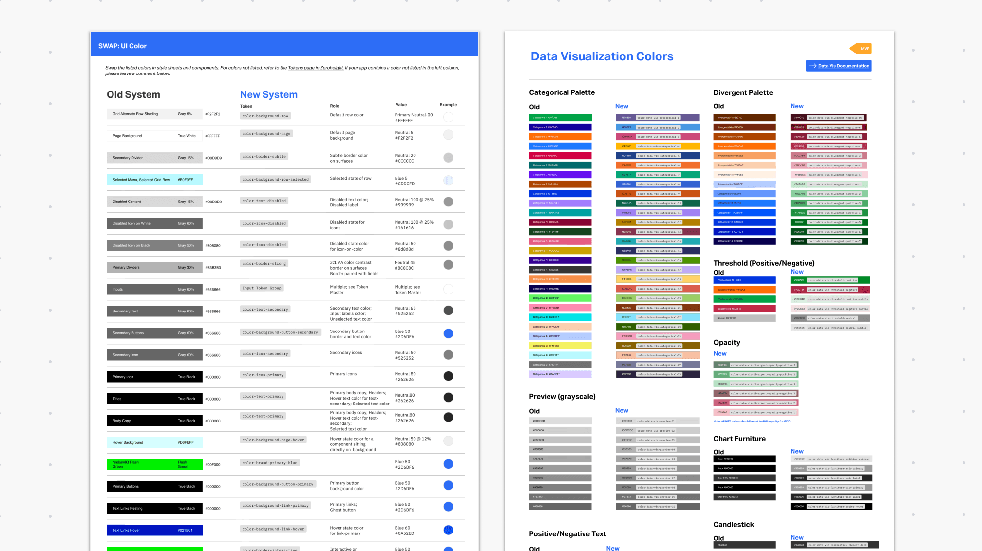
As design system owner, I led both migration challenges in Rebrand 2. The first — component-level tokens across the UI — built on the foundation and methodology I'd established in Rebrand 1. The second was harder: the shift from black/flash green to blue reached into the entire data visualization library, not just components. Because NIQ's acquired platforms (Precima, Activate) run on third-party BI tools — Qlik, Sisense, Highcharts — rather than NIQ's own, each came with its own constraints on font swaps and color control. I owned the full chart token migration, governing and executing within those disparate, non-negotiable limits.

Component-level tokens and major shift in data visualization

As design system owner, I led both migration challenges in Rebrand 2. The first — component-level tokens across the UI — built on the foundation and methodology I'd established in Rebrand 1. The second was harder: the shift from black/flash green to blue reached into the entire data visualization library, not just components. Because NIQ's acquired platforms (Precima, Activate) run on third-party BI tools — Qlik, Sisense, Highcharts — rather than NIQ's own, each came with its own constraints on font swaps and color control. I owned the full chart token migration, governing and executing within those disparate, non-negotiable limits.

Better WCAG 2.2 Compliance & matching users' mental models

The shift to a light background resolved what dark mode couldn't — complex data layers, empty states, and interaction surfaces all readable without fighting each other. And with green no longer carrying brand identity, red and green returned to their only job in analytics: positive and negative. The color system finally matched what users already knew.

Better WCAG 2.2 Compliance & matching users' mental models

The shift to a light background resolved what dark mode couldn't — complex data layers, empty states, and interaction surfaces all readable without fighting each other. And with green no longer carrying brand identity, red and green returned to their only job in analytics: positive and negative. The color system finally matched what users already knew.

Delivery & Outcome

The true ROI of our systemic overhaul was realized during a second, consecutive product rebrand. By leveraging 100% component reuse from the first migration, we executed the second rebrand at just 15% net-new effort—dedicating that bandwidth entirely to solving our remaining technical debt in data visualization.

Most importantly, we ensured absolute business continuity. Enterprise clients, including Rite Aid, Jumbo, and CVS, remained live without disruption across both transitions, culminating in a new contract signing from Walmart Canada mid-implementation.

Recognizing this cross-functional success, the organization subsequently tapped me to lead the design system merger for the broader NIQ Retail Platform (Activate).

Delivery & Outcome

The true ROI of our systemic overhaul was realized during a second, consecutive product rebrand. By leveraging 100% component reuse from the first migration, we executed the second rebrand at just 15% net-new effort—dedicating that bandwidth entirely to solving our remaining technical debt in data visualization.

Most importantly, we ensured absolute business continuity. Enterprise clients, including Rite Aid, Jumbo, and CVS, remained live without disruption across both transitions, culminating in a new contract signing from Walmart Canada mid-implementation.

Recognizing this cross-functional success, the organization subsequently tapped me to lead the design system merger for the broader NIQ Retail Platform (Activate).

Before & After - 3 Design Systems - tokens - components

Before & After - 3 Design Systems - tokens - components

Before & After - 3 Design Systems

Before & After - 3 Design Systems

Rebranded NIQ Retail

Rebranded NIQ Retail

Epilogue: NIQ Activate Rebrand

The reward for good infrastructure is a harder problem. After the blue suite shipped, NIQ handed me the next one: Activate — a sibling analytics platform, equal in weight to Retails. The brief: rebrand ~20 views. The deadline: one week. The inheritance:

  • A stale Figma file — product and design no longer matched. On one page, text inspecting at 13px rendered the same size as 16px.

  • Tokens mostly primitive, governed through an Excel whitelabel sheet. Icon states and systems different from Global NIQ.

  • A mix of React and Angular components underneath.

  • Continuous WCAG failures — so the rebrand doubled as an accessibility pass, UX defects logged along the way.

Mid-week the scope grew: new screens arrived needing full report redesigns, not color swaps — while I still held my Retail modules. And one catch I’m still glad about: the dashboard was clipped mid-panel, straight through “Most recently viewed”, with no scrollbar — live, and nobody had noticed. I asked “how can users use this?”, added the horizontal scroll, and logged it.

One week was enough — not because the work was small, but because the method existed: audit first, tokens next, components in batches. The same sequence that carried Retail through two rebrands carried Activate through one. Extreme timelines don’t cancel the strategy — they compress it.

Hire her immediately.

Dan Riley

UX Manager, NIQ

"Good job Amy, here is Activate"

After the success of the Double Rebrand, the organization trusted me for a new Rebranding mission: NIQ Activate - which is now the official NIQ Retail platform. Third Rebranding with successful outcome.

Visit live product: https://nielseniq.com/global/en/products/niq-activate-lite/