PLATFORM NAVIGATION · INFORMATION ARCHITECTURE
NIQ Platform Navigation Architect
NielsenIQ runs 100+ B2B analytics apps — and every one navigated differently. I led the convergence: a single, consistent navigation and information architecture across the platform, researched, prototyped, and A/B-tested to ease the learning curve for 23K clients and cut the cost of maintaining divergent systems.

Clients
TL;DR
Context
NielsenIQ’s 100+ B2B apps each navigated differently — top nav in one, side in another — making the platform hard to learn and costly to maintain.
Insights
Users voiced concerns about the divergent experience. Secondary research and competitor benchmarks (IRI, GFK) showed side-navigation is preferred for complex apps, and five recurring menu themes could unify the top level.
Solution
I defined a consistent multi-layered navigation structure satisfied all 5 navigation representatives, validated by usability testing Version A (top) against Version B (side), in Maze across five real tasks.
Impact
Version B won on time-on-task, missed clicks, and usability — a seamless cross-app navigation that eases the learning curve, lifts conversion, and reduces maintenance cost. The solution rolled out eventually to 100 apps, affecting 23000 B2B clients across our 100+ products sharing same NIQ ecosystem.
Case Study Map
THE WHOLE STORY, FAST
5 Min Read Version
At a Glance
Over three months, on and off, I led navigation and information-architecture convergence across NielsenIQ’s 100+ B2B apps — auditing the current navigation, defining a consistent structure, and validating it through usability and A/B testing. The goal: one seamless experience that eases the learning curve and cuts the cost of maintaining divergent systems.
Duration
3 months (on and off)
Role
Product Designer Lead · Designer for Activate & Discover platforms
Scope
Navigation & IA convergence · Consistent top-level menus · 2nd–4th-level UI patterns
Scale & Impact
100+ NIQ products · Activate + Discover · 23K B2B clients · 95 countries
The analytics platform behind 23,000 retailers and manufacturers.
NIQ builds 100+ B2B applications that help brands and retailers — Loblaws, Walmart, Johnson & Johnson, Coca-Cola — understand shopper behavior from their own and market data.
NIQ recently launched Cadence, a system of 19 coordinating agents, sitting directly on this foundation. The interface went conversational and the language changed, but the core mechanism didn’t: the infrastructure I architected is the foundation modern AI agents rely on.
NIQ Eco-system & structure: 100+ products, 2 main platforms and multiple satellite apps
NIQ’s rich ecosystem features over 100 products serving 23,000 clients across 95 countries. Most clients access multiple reports across our main platforms, NIQ Discover and NIQ Activate, as well as satellite apps—making a seamless and unified navigation experience essential across every tool.
Five Navigations, One System: A Multi-Faceted Spatial Puzzle
To unite our navigation into one seamless system that works for everyone, we selected five representative applications as our baseline. Our goal was to translate two distinct visual dialects—top navigation and side navigation—into a single coherent design language without disrupting each product’s internal logic.
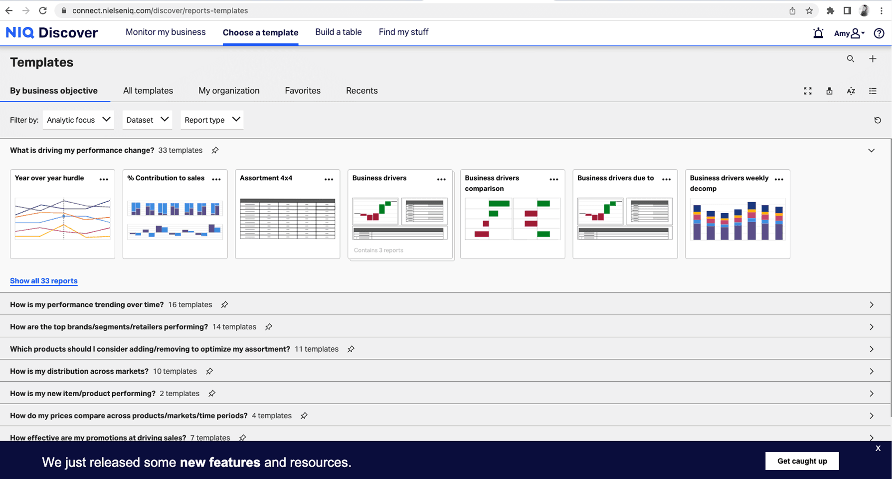

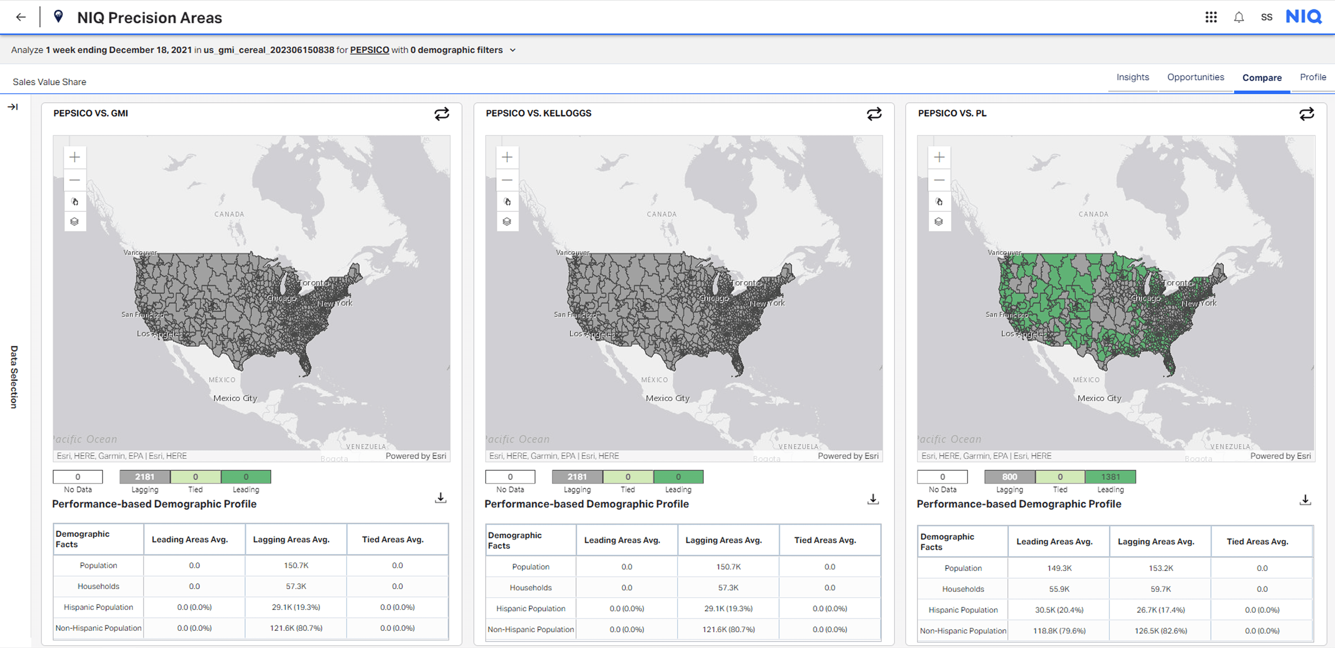


Scope & Constraints
100+ PRODUCTS · 23,000 B2B CLIENTS · 95 COUNTRIES · 2 PLATFORMS, DIFFERENT VISUAL DNA · 5 designers owning different navigation types · All of it having to work as one coherent system simultaneously.
The constraint that makes this genuinely hard:
🖥️ Open-heart surgery on a live patient.
You cannot break what's already in production. 23,000 B2B clients are using this right now. The navigation isn't a greenfield problem — it's open heart surgery on a live patient.
📁 Multi-layered Architecture:
Platform-level switching: Seamless transition between core platforms.
Intra-app navigation: Fluid movement across modules, nested sub-modules, and specific pages.
Granular views: Uninterrupted access down to drilled-down reports and integrated micro-services.
⚙️ A Service bar built for a five-year vision
The system needed a scalable, five-year vision—specifically provisioning dedicated UI slots for future AI integrations, global services, and expanding platform capabilities.
Solution - Sophisticated multi-layered navigation system
My solution anchored around a flexible side-navigation prototype—a design model capable of unifying distinct visual dialects, supporting deep hierarchy, and preserving critical viewport real estate without breaking existing client workflows.
Level 1: Global Navigation - Cross-platform and cross-products navigation
The top layer handles cross-platform switching: a persistent global navigation connecting NIQ's two primary bodies — Discover and Activate — and satellite apps across the ecosystem (Shelf Architect, Precision Areas, Revenue Optimizer) via a Bento menu.
Level 2: Platform navigation - Persistent navigation points across all NIQ ecosystem
The structural decision was consistency: 5 navigation nodes — Home, Report, My Stuff, Configure, Planning — persist identically across every NIQ application, regardless of platform. A user moving between Discover, Retail, or any satellite app never relearns the map, because the map doesn't change — the same way walking into any Costco anywhere tells you exactly where everything is. Within that fixed architecture, the layer serves two user types simultaneously: first-time users follow guided paths built from peak traffic and primary journey analysis; expert users shortcut directly through My Stuff into saved reports, modify parameters, and run — skipping navigation entirely for workflows they repeat most.
Level 3: In-report navigation: Tabs, nested tab and Drill-down reports Parents-child relationship with breadcrumbs
At the deepest layer, navigation moves inside the report itself. A reconstructed page header supports two mechanisms depending on the relationship between views: tabs and nested tabs for lateral sibling navigation within a report, and breadcrumb trails for parent-child drill-down hierarchies where users move between summary and detail. Both preserve orientation across any depth — users can move freely between levels without losing their place in the structure.

Level 4 — Services Layer & AI Agent
The bottom of the side navigation holds persistent utility functions — Alerts, Usage, Help & Documentation, and User Profile — accessible from any state without disrupting the current view. The same layer is home to Arthur, NIQ's AI agent, who surfaces through the search bar rather than a dedicated entry point: type to search, or ask. The decision to embed Arthur in search rather than give him a standalone icon reflects how the ecosystem was designed — not as a discrete AI feature, but as a capability woven through data selection, forecasting, and report generation across the whole suite.
Parallel Effort
Overhauling Page Structure Blueprints
Shifting from top to side navigation wasn't just a visual update—it fundamentally changed how every page redistributes screen real estate. To support this, I spearheaded a parallel redesign of our underlying page structure blueprints. Since this is a comprehensive system of its own, I've left it out into another standalone case study, but we can easily dive into it during our interview.
HOW I ACTUALLY SOLVED IT
Deep Dive
The complete case study with sharing details about methodology, challenges, solutions and how we navigate the usability testing.

Further details can be discussed during the interview
Deep-dive detailed case study is in progress